- Google Search
- Google Spreadsheets
 I have already posted about how to put photos on Google Maps and in this post I would like to show how easy it is to put data on a map using Google Fusion Tables. Fusion Tables is a lesser known Google Service and it is not quite as intuitive as other Google Docs. Still it is easier to create a mashup with Fusion Tables than using Yahoo Pipes or using the programming API.
As an example I will use technical colleges in Austria.
I would like to visualize three pieces of information:
I would like to visualize three pieces of information:
- Location of the school
- Size (how many students there are)
- Additional information when clicking on a school (areas of specialization)
Of course the first step will be to find the required data on the Internet, which I found on Wikipedia:
http://de.wikipedia.org/wiki/H%C3%B6here_Technische_Lehranstalt
As it is rather inconvenient to enter data manually into Fusion Tables it is best to copy the data into a Google spreadsheet and then import the spreadsheet into Fusion Tables. You can also use the importHTML function in Google Spreadsheets to import the data from Wikipedia (but you have to be find the correct table number, as it might not be the first table on the page that contains there required data).
=ImportHTML("http://de.wikipedia.org/wiki/H%C3%B6here_Technische_Lehranstalt", "table",4)
The next step is to go to the menu “visualize > map” and geocode the data. The table contains two rows which are eligible for geocoding: name (as the name of the school contains its location) or place. You might have to edit the location in order to obtain the correct place marker on the map.
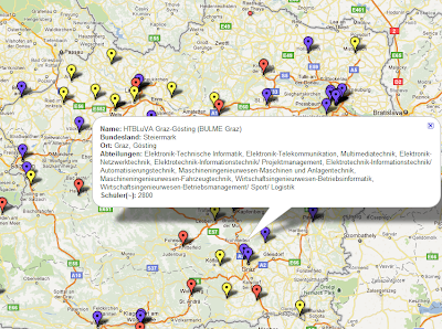
The result is a map with place markers for each table row. To make the map more informative choose “configure styles” and edit “marker items/buckets” (see image). Choose the column that contains the required information (in the case that number of students attending the school) and add more buckets if you want differentiate the data. I create three buckets: schools with up to 500 (yellow), up to 1000 (red) and up to 3000 students (purple), but you can choose your own scale as well as your own colours.
You also get the options to embed the finished map in a website (Moodle, Blogger, etc.) or to export the data as kml file to Google Earth or Google Maps.
So here is an overview of the necessary steps:
- Paste or import the data to a Google spreadsheet
- Import the spreadsheet to Google Fusion Tables
- Visualize (menu) and configure visualization style
- Export the map to Moodle, Google Maps/Earth or simply share using the link (don’t forget to make the table public before doing so!)
Here is the link to the example used in this post:
https://www.google.com/fusiontables/DataSource?snapid=S249783bb35


.png)


